After the financial crisis of 2008–09, financial commentators loved to take shots at “old school” investment strategies. First came the declarations that diversification no longer works, because during a crisis everything goes down together—though this wasn’t true in 2008 unless you ignored bonds, which make up a significant part of most portfolios. Then the investment industry sounded the death knell for the traditional balanced portfolio. Apparently we were in a new era where active investing, tactical asset allocation and alternative asset classes would rule the day.
One of the most effective ways to expose this nonsense is to build a “periodic table” of investment returns. (Norm Rothery has maintained one on his Stingy Investor site for several years.) The resemblance to the poster that hung in your high-school chemistry class is only superficial: this table simply presents the returns of various asset classes ordered from highest to lowest over a period of several years. By adding a colour for each asset class, the results jump off the screen.
I thought it would be interesting to build a periodic table with the returns of the seven individual asset classes in the Complete Couch Potato, as well as the returns for the whole portfolio. Here’s what the results look like for the last six years:
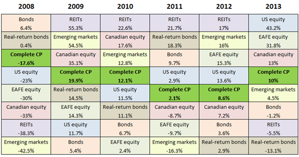 Periodic tables almost never show any discernible pattern. In some cases, the best performer in one year becomes one of the worst in the next, or vice-versa, which is an argument for rebalancing. But it’s never that simple. If you declared REITs overvalued after their 2009 run-up, for example, you missed another three outstanding years. If you feared rising interest rates after 2008, you missed four strong years of great bond returns. It’s impossible to imagine how anyone could have consistently predicted which asset classes would have ended up at the top or bottom of next year’s column based on past performance, economic forecasts or traditional valuation methods.
It’s not surprising to find the balanced Couch Potato portfolio fell near the middle every time—that’s exactly what you’d expect. More interesting is that each individual asset class finished above the balanced portfolio at least twice, and below it at least twice. With the exception of bonds, all of these assets classes showed significant volatility: emerging markets, REITs and real-return bonds in particular. And yet when these volatile asset classes are combined, the result is the dramatically lower volatility of the portfolio as a whole.
Diversification doesn’t work? The traditional balanced portfolio is dead? Seems to me these old ideas have never been more relevant or useful for investors. It’s the forecasters and the tactical asset allocators who have the explaining to do.
Data in the above table were supplied by Libra Investment Management, except for REITs, which are based on the S&P/TSX Capped REIT Index. All returns are in Canadian dollars. Returns for the Complete Couch Potato were calculated using the methodology described here.
@Brian: I use iTrade as well, and they offer a wide range of GICs from third parties: you just have to phone them to purchase. RBC and BMO offer a whole menu of GICs from multiple providers online. RBC and TD also have at least four ISAs each, all of which are separately covered by CDIC. If I was concerned about running up against CDIC limits and my brokerage didn’t offer this kind of access to GICs and ISAs, I would switch brokerages.
@Gerald: These posts may help:
https://canadiancouchpotato.com/2012/03/12/ask-the-spud-investing-with-multiple-accounts/
https://canadiancouchpotato.com/2012/03/15/a-spreadsheet-to-manage-multiple-accounts/
Questrade also offers commission-free GICs from 18 CDIC-insured institutions, and a number of ISAs (though you would pay their standard commission on mutual funds to deposit and withdraw).
@CCP Thanks for the tips. How did you find out that iTrade offers GICs? I searched their site and found nothing. I’m not a Scotiabank customer, just iTrade so maybe that makes a difference? Also, is there any place to see what the rates are.
@Brian: iTrade definitely does a lousy job of letting people now how to buy GICs! Unfortunately there is no way to browse rates. But what I often do is search online for current rates on a generic site like this:
http://www.financialpost.com/personal-finance/rates/gic-annual.html
That gives you an idea of what is generally available. Then when you call iTrade and ask for their best rate on a specific term, you can compare it. You won’t get the highest rates listed here (some are available only through credit unions directly) but their rates are competitive.
Regarding GICs – help me spot what I am missing:
My savings account pays 1.05% interest. A 23-month GIC at the same bank pays 0.95%. Why would I buy a GIC? The interest only exceeds that of the savings account if you give them your money for more than three years and even in that case it is only by the most trivial of margins.
Related …
For the past few months, as an experiment, I put some of my money, equally, into iShares commission free CLF and CBO 1-5 year laddered bonds. I’ve actually been impressed by the return. Whereas my savings account has returned about ~$17 per $20k/month. My ishares bonds have returned ~$75 per $20K/month.
Hey, stop laughing, I’ll take any nickel I can find!
If you do the math it does work out to ~1% vs ~4.5%. Now, I’m not sure the risks inherent in these 1-5 year laddered bonds, but over the past two months of monitoring them daily, I am quite comfortable with the slight priced fluctuations. I’ve actually considered dumping all my money into them.
As an alternative to a savings account, what possible risks am I facing with these short term laddered bonds? It appears there’s little to chose from insofar as GICs and “High” interest savings accounts (the latter can nudge 2% if you shop around). So as a safe haven for money you don’t wish to gamble with in the stock market, is it a reasonable choice?
@Chris, Very simply, bonds can decline in value, causing some loss of capital. A GIC will not do that. I know you’ve said that you have monitored the price over the past couple months, but this is by no means representative of what *might* happen in the long term.
These are all just rungs on the risk/return ladder. There is no free lunch. In exchange for a higher return, you must take higher risk and generally accept higher volatility. Cash is a “no risk” (of capital loss) investment, but it pays you little to no return. GICs are a virtually-zero risk (of capital loss) investment, and likewise don’t offer much return. Bonds as a broad asset class are on the lower-end of the risk spectrum, but are not no-risk. You get a higher return in exchange for some risk of default/devaluing/capital loss. Stocks generally move you further on the spectrum, higher potential returns, but increased volatility and higher probability of loss.
@Willy,
Hey, thanks. This is all reasonable. I suppose my question more relates to pre/post apocalyptic zombie nightmare events. For instance, even when I look back over 6 years with CLF. I don’t see any real “danger” even through the market crash in 2008. If anything, it seems to benefit a bit. I can handle slight declines. I’ll just pull out after a year if I’m not exceeding the interest from a savings account. A few percent won’t kill me.
Playing with Stingy’s backtesting, the worst short bonds do over 33 years is -1% in 1994.
But there is one instance where they lost 99%. In German style hyperinflation between 1923-1924. I guess my question is, if I wake up tomorrow, is there any event that could transpire where my short bonds suddenly drop 30-50% of their value. W ill I know a hyperinflation scenario when it occurs? Were I in Germany during 1923 … did hyperinflation descend without warning laying waste to everything in it’s path, Smaug style, or was it a gradual bloodletting over the year? Is it an event one should protect oneself from? Can one?
As I look at my goals, it seems my interest, at this point, is protection first, return a distant second. I feel more comfortable building my wealth through work and savings rather than compounding interest in the market. However, I won’t pass up a *relatively* free lunch if it’s available.
(I know, I was on about 50-50 portfolios before. But after some digging, they seem to have a remarkable correlation to the stock market. Upwards of 96%. I can’t get behind something like that.)
Thanks guys.
@Jerry, if your savings account pays more than a GIC, then you wouldn’t buy a GIC. In your case, your bank is not offering competitive rates on GICs (or on your savings account, for that matter). On the other hand, through my discount brokerage, I could get a 1-year GIC paying 1.65% today, and if I wanted to open an account with one of the Manitoba credit unions, I could get 2.15%.
But the only reason you’d get a 1-year term is if you think you need the money in one year. If you’re saving/investing for the long term, you might opt to build a 5-year ladder where the returns are higher. Judging by the numbers you’re quoting, getting that GIC from your bank would not be a good idea, but your brokerage can probably get you a much better rate. As we were saying earlier, the return from a 5 year GIC is comparable to a 10 year government bond.
@ Canadian Couch Potato: I have been reading your blog for while and find it really invaluable thank you! I’m not sure if it has been addressed yet, but I was wondering what someone with a portfolio which is all invested in a taxable corporate account should do to diversify and minimize volatility. From what I read on your blog, bond etfs should not be invested in a taxable account, does that mean the allocation to stocks should be 100% to avoid high taxes?
@Chris, I understand completely where you are coming from, but believe there is no good answer. The problem with “zombie apocalypse” events is that they are almost certain to happen “eventually” (entropy, and all that), but you have almost zero probability of predicting when or in what form. That makes it impossible to plan around them, and suggests there’s credibility to the argument that you have an extremely high probability of costing yourself significantly by attempting to try. The “probability tree” would suggest that you have no practical choice but to ignore these.
In the grand spectrum of risk, shorter term government bonds (like CLF) are pretty safe in my opinion. Is it possible for them to decline 50%? I’m not going to say never. But I’d be willing to say the odds of that happening in your lifetime are narrow. That said, you don’t get a great return for them (YTM is only 1.38%), so commensurate with the relatively low risk, you are getting a return that is barely better than cash. (Check out some articles on this site on YTM and duration – you may think you will get higher returns from CLF than you actually will).
If you desire protection over return, and loss of capital is something you want to avoid, then realistically you need a very conservative portfolio, and I think CLF is a relatively conservative holding, so I’d say it fits somewhere in there.
Hi guys! First time poster. I’ve started getting interested in investing 1,5 years ago when I was about to buy my first property, a condo. Did some research at the time, and decided to invest my money instead. Problem is, I’ve been keeping my money in a TFSA at ING making 1,4%, too chicken to do anything. But not anymore. I’ve opened 2 TFSA at virtual brokers (one for my babe to), and I’m ready to build myself a CP type portfolio using ETFs. Should I go through with this or should I invest in the ING Direct Streetwise Portfolios? Cheers!
@Chris B: I’m concerned you may be looking only at the interest payments from CLF and CBO and mistaking these for the fund’s return. These ETFs pay out about 4% to 5% in distributions, but their yield to maturity is much lower (just 1.38% for CLF before fees). So you may be overestimating their total return. I should also mention that if these funds are held in a taxable account, they’re a disaster:
https://canadiancouchpotato.com/2010/11/22/bonds-gics-and-the-yield-illusion/
https://canadiancouchpotato.com/2013/08/07/is-your-bond-fund-really-losing-money/
https://www.pwlcapital.com/en/Advisor/Toronto/Toronto-Team/Blog/Justin-Bender/May-2013/2012-Negative-After-Tax-Return-on-CLF
@John: You’re right that bond ETFs are a poor choice in a corporate account, and that’s true of personal non-registered accounts as well. But that never means you should use a 100% equity portfolio: the decision has to be based on risk first and taxes second. (For the record, foreign equities are quite tax inefficient in a corporate account, too.) GICs are a good substitute for bonds and bond funds in taxable accounts:
https://canadiancouchpotato.com/2013/03/06/why-gics-beat-bond-etfs-in-taxable-accounts/
@ABegin: If you’ve already opened the accounts at VB you may as well give ETFs a try: just keep it very simple! If you find it’s more difficult to maintain than you had hoped, you can always switch to ING.
@ Dan & Willy:
Okay, I’m a dupe. Thanks gentlemen for the feedback and links, they were exactly what I needed to read. And exactly addressed my error earlier. My estimated YTM for CLF is 1.38% as you wrote, CBO is a little better at 1.95%. Nonetheless, if I really wanted to go that route, I could find high interest savings accounts that would provide nearly an equivalent deal with zero volatility. And Dan, thank you for the reminder that I don’t want to be holding these in a taxable account, yikes.
If I’m reading things right, it seems that bonds have value as a bit of a hedge if you’re holding stocks and the market fizzles. However, as a stand alone replacement for a savings account:
http://www.highinterestsavings.ca/chart/
I’d say one would be better off with an HISA. I like the idea of liquidity, so the GICs don’t really appeal to me. Tying your money up simply to keep up with inflation just sounds like a crummy deal, although perhaps that may be the safest approach one could take.
No free nickels, apparently. And no asset allocation will apparently save you from an entropical (it should be a word) black swan zombie apocalypse.. You put your money in stocks, the market crashes (2008). You put them in bonds, and inflation eats away at you. You buy gold bullion and the market soars (2013).
I’m starting to think maybe Smaug had it right …
@Tyler: for the sake of completeness, that Manitoba credit union offering 2.15% for a 1 year GIC also offers 1.9% for a savings account, in case you were worried that you might need access to some or all of your income portion before the full 12 months is up; so you can build quite a bit of short term flexibility in your income/GIC ladder.
Further to the above, I just checked and found out that Outlook Financial is offering CASHABLE GICs 1-5 years in the range 2.2% to 3.1% (Implicity’s rates, while similar, specify that the GICs are NON-CASHABLE). Sure, there will be some penalty for cashing a GIC early, but that is still better than not having the funds available for another year if there is a sudden downturn in your equities, and you really need to rebalance now.
@Oldie, just note that you’ll only get 1% interest if you do cash them early. E.g. if you cash a 5yr GIC, at 4yrs+11m, you’ll only get 1%. Not a big deal, if you have a ladder and plan for it but don’t go buying only 5yr GIC’s thinking you can cash them when you want to rebalance.
Also, note that they are not CDIC insured or backed by any government entity. Essentially, the credit unions in Manitoba are self insured as a group. So in the event of a zombie apocalypse or other systemic risk you’ll be out of luck. Whereas with CDIC insurance the government of Canada could always print money (effectively borrowing from everybody) to pay you back in the event of a systemic risk event.
Chris B
CBO might be good in a TFSA on a DRIP if set up in the correct amount to buy whole shares.
I like GIC ladders, HISAs and have a need for substantial liquidity for some spending needs (I am an old school saver and have always forgone spending toward reducing portfolio volatility). Several years ago I did a simple study on the returns from cash during periods of inflation 3 month T BILL rates as they correlate with CPI in a regression analysis. I will post specific results some time but the gist is certain types of cash holdings haven’t been all that bad during inflation with caveats. There isn’t a lot of literature on this and there’s a kind of mantra that cash is very bad which I think is a function of some advisors seeing assets under management figures being lower for someone who wants a larger cash holding. The ultimate inflation correlation depends greatly on how correlated the cash instrument is to money market rates and tax rates on the interest. How much cash like funds ( incl for me 1-2 yr GICs) to hold for me is a constantly changing balancing act based on having an emergency cushion, monthly cash flows, upcoming expenses that have been saved for and portfolio rebalancing needs.
I know CBO didn’t initiate until Feb 2009 but has anyone done any projections to see how they would have faired in 2008? I asked ishares about this twice but they didn’t answer. Clf initiation was Jan 31, 2008. I calculated their TR was 7.66% for the remainder of 2008 (11 months).
@Bernie: No ETF provider will ever guess what one of their funds would have returned before it was launched. But you can get an idea by looking at comparable funds. XSC, iShares’ other corporate bond ETF, lost a bit in 2008. The Barclays US 1-5 Yr Corporate Index lost about 3%. Bottom line, corporate bonds don’t offer the same diversification benefit that government bonds do during a crash: they’re not part of the “flight to safety.”
In an effort to keep the comment threads on this blog relevant to the original posts (or at least to index investing), please continue the GIC and HISA discussions on this forum:
http://www.highinterestsavings.ca/forum/
New Insight: Reviewing this weeks head article, at first glance the Periodic Table for the last 6 years confirms my rather simple first level understanding from my last year’s learning of the power of diversification in Passive Index Investing. It is obvious that if the average risk of a diversified portfolio is somewhere in between the risks of the components and if the average likely profit also ends up somewhere in between, that would be a good thing. My somewhat vague assumption that, between 2 diversified assets, the resultant risk and return of the mix would be predictable by proportionality depending on the ratio between the two component sizes was in error! I had either forgotten, or never understood the the subtle point the first time round that this was only so if the 2 assets were 100% correlated (i.e. with a correlation of 1.0).
I have just read Rick Ferri’s book “All About Asset Allocation” (from the CP resource list), and finally got what I should have got last year — for any pair of different assets, if they are anything less than 100% correlated, the line between the two asset points on the risk and return graph changes from a straight line between the 2 points to a swerving line that, under ideal circumstances (-1.0 correlation, that is, totally uncorrelated, and a rising market, say,) swoops up from the lower risk, lower return asset, and to the left, REDUCING RISK, and INCREASING RETURN before it curves up and right again to intersect with the other asset; so a 50-50 mix of these assets may give you an intermediate return with THE SAME OR EVEN REDUCED RISK (relative to the least risky asset!) The real world situation is always somewhere in between -1.0 and +1.0 correlation. If you re-apply the same mental process to every pair in the diversified portfolio, it is now obvious to me that the benefit of diversification of asset classes in a passive portfolio with disciplined regular rebalancing is far greater than the mere averaging benefit that is obvious at first glance. This is a huge insight for me.
I am sorry to drag out the explanation like that, especially for those who can recite it backwards in their sleep, but I wanted to encourage newbies like myself that continued relevant re-reading and reflecting keeps on generating fresh insights that confirm and even reinforce the simple though powerful understandings that come easily and initially to the neophyte.
Hello CCP,
Here is my situation. I am closing down my “actively managed” brokerage account, and have initiated the transfer process (in cash) to my (recently opened) Questrade online brokerage account. The funds (about $125,000) should be there in the next few days. It is going from an RRSP, to an RRSP account on Questrade.
I have read your “Guide to the Perfect Portfolio” book (excellent read, by the way!), and have decided that your “Complete Couch Potato” model is right for me, given my risk tolerance and horizon.
Question 1: This is in regards to the US-listed funds suggested in the “Complete CP” model (VTI and VXUS), and the attendant issue of currency conversion costs. Given that mine is a registered account, is it a better strategy to use their Canadian-listed substitutes instead (VUN, and XEF/XEC)? I understand that I would be paying higher MERs with the Canadian-listed funds.
Question 2: I read about DRIP plans (dividend reinvestment) in the “Perfect Portfolio” book. This sounds like the right approach to me; do you agree? From a process point of view, would I simply have to set this up (on Questrade) for each ETF that I buy?
Thanks, and best regards.
Jean.
@Jean: Using Us-listed ETFs in an RRSP does result in lower management fees and less drag from foreign withholding taxes. However, the trade-off is the high cost of converting Canadian to US dollars. Based on the size of your portfolio I’d want to steer you toward Canadian-listed ETFs.
Regarding DRIPs, yes, these are quite convenient and generally easy to set up simply by calling or emailing your brokerage and asking which ETFs are eligible for DRIPs.
@Jean, just an FYI; Questrade doesn’t charge anything for ETF purchases so you have the choice of setting up DRIPs OR manually reinvesting dividends yourself every month. The benefit of doing it yourself is that you can try to rebalance as you go. The downside is that it is a tiny bit more work.
Thanks for the response CPP! Do you see any problems in going with free trading ETFs only?
@CCP: Thanks for the advice, I appreciate it. Based on the size of my portfolio ($125K), I calculated that substituting the Canadian-listed ETFs for the US ones would only add roughly $75 to my annual expenses. Just as an aside, I just received my annual statement from my current broker; it shows that I paid almost $3300 in expenses. If I had been using the CCP approach, they would have been about $425. Those savings alone, repeated and compounded over the next 10 years, would yield me around $40K at 6% pa. (My calculations may be off a bit, but the conclusion is not!)
@BrianG: That’s an interesting option, thanks for bringing it up; I will certainly consider it!
@ABegin: Not in terms of cost. I have just seen a lot of new investors struggle with the logistics of trading ETFs properly, and with the temptation to tinker with their asset allocation rather than sticking to their plan.
@Dan: In your reply to me, you indicated that “Using Us-listed ETFs in an RRSP does result in lower management fees and less drag from foreign withholding taxes.”. I don’t know much at all about foreign withholding taxes; do you have a thread on one of your blogs that discusses that?
Secondly, regarding the CAD-to-US conversion – what would be the approx. cost to convert, say, $1000 CAD? Would the ratio be the same if it was $10,000?
After losing a bunch of money and time with a bad investment advisor, I’m trying to take my finances into my own hands. I’ve been reading your blog a lot, and it’s inspired me to really start doing my research!
My goal is to balance my holdings by country and sector, and I want to hold some bonds. I’m relatively young (30), so I’m comfortable with a smaller % of bonds than the typical 40% allocation that is suggested. And, I want to keep my ETF purchasing fees down, because I will be investing automatically on a monthly basis. So, the idea is to have one ETF (set to DRIP) and one mutual fund.
I’m thinking of setting up monthly automatic investments as follows:
1. Invest 50% in TD Comfort Balanced Growth (TDB887) – 5yr return of 10.81%
2. Invest 50% in Vanguard Total International Stock Index (VXUS) – 10yr return of 12.53%
Both holdings have a good sector diversification (although there is a slightly high weighting of financials). TDB887 provides domestic bonds (40%), Canadian Equity (30%), and US. Equity (30%). VXUS covers Europe (47.1%), Emerging markets (17.4%), and Pacific (28.1%) equity.
With a 50/50 investment in these VXUS and TDB887, I’d have an effective portfolio distribution of approximately:
• 20% Canadian Bonds
• 15% Canadian Equity
• 18.5% U.S. Equity
• 23.5% Europe Equity
• 14% Pacific Equity
• 8.7% Emerging Equity
My questions:
1. Is my geographic and sector balance sufficient?
2. Does it make sense to purchase only one ETF even though TDB887 has an MER of 2.03%?
3. Does this strategy look okay to set and forget?
@Jean: I really hesitate to dump a lot of information on you, but I will provide a couple of links. My inclination is to encourage you to stick to Canadian-listed ETFs, which are far more user-friendly.
https://canadiancouchpotato.com/2012/09/17/foreign-withholding-tax-explained/
https://canadiancouchpotato.com/2012/12/17/how-much-are-you-paying-for-us-dollars/
@David: I’m not sure it ever makes sense to start the discussion with an actively managed fund that charges over 2%, especially for a DIY investor who is receiving no advice for that fee. Why not just adapt the Global Couch Potato (using TD e-Series funds) for your own situation by lowering the allocation to bonds? The only difference is the GCP has no emerging markets, but these can be added later if you want them. Your costs would be a lot lower and you wouldn’t need to bother with US-listed ETFs, which are expensive to trade unless you have US dollars.
@CCP: Earlier in the comments you reminded @Jim that the Complete Couch Potato did contain Emerging Markets because VXUS does contain Emerging Markets. However, I was wandering if that kind of inclusion in holdings does really justify pointing out the diversification benefit of both sub-asset categories like Emerging Markets and EAFE Equity if they are both part of one over-lying holding of VXUS.
I understand the diversification benefit of holding VXUS as a whole because it has its own risk but likely does not correlate exactly with other equity assets, and so may be rebalanced with benefit when preset proportions get out of whack. (And the same argument may be applied to every other re-balance-able asset in the portfolio). Encouragingly, EAFE Equity and Emerging Markets, in quite a few of the years tracked, end up being quite far apart on your periodic table. However, as I understand the way VXUS is put together, in the years where Emerging Markets does relatively better than EAFE, it would be held in a higher proportionality than before, because of greater capitalization, and and in other years, vice versa; this would seem to me to be opposite of what we would want in rebalancing for optimum tweaking to get our free lunch out of diversification. Or do I misunderstand how Vanguard adjusts the proportion of EAFE and Emerging Markets in VXUS?
Hi CP,
I’ve followed your blog on and off for a long time now. Thanks for all the great tips.
Given your exchange with Jean, I was just wondering why you didn’t advocate for a Norbert’s Gambit from CAD->USD. There are some additional considerations in currency risk, but Jean could very cheaply convert $50k CAD (for example) to USD, get on some of those US-listed stocks (especially in the RRSP), and diversify his holdings (including currency).
Thanks!
@Adam: Jean gave no indication he (or she?) was familiar with Norbert’s gambit, and in my experience it isn’t something for a novice investor to attempt. And because Jean is at Questrade the technique may be even more problematic, since my understanding is that brokerage is not supportive of it. For many investors it’s better to go with the simpler solution than to choose a much more complex one in order to save a few basis points in fees or taxes.
Remember, too, that holding US-listed ETFs rather than Canadian-listed equivalents does not affect diversification or currency risk:
https://canadiancouchpotato.com/2014/01/13/how-a-falling-loonie-affects-us-equity-etfs/
https://canadiancouchpotato.com/2014/01/16/currency-exposure-in-international-equity-etfs/
Dan – I’m just finishing up the asset allocation determination as I move my portfolio from an advisor-led Mutual Funds one, to an ETF DIYer. I’m thinking of splitting my FI allotment equally b/t gov’t, corp and real return bonds – would you see any issue (diversification or other) with the following (I’m content with the overall 30% in FI):
Side Note: I’m fine with Norbert’s Gambit (have completed it in past)
Side Note2: Portfolio size reasonable for holding higher end range for # of ETFs
Side Note3: Rebalancing not a big concern as I have monthly inflows “available” plus an employee ESOP that accumulates and I can make semin-annual sales to divert to this portfolio
Side Note4: All to be housed in RRSP & TFSA between myself & wife
Cdn Eq (VCN): 20%
US Eq (VTI): 20%
Int Eq (VEA): 15%
Emerg Eq (VWO): 5%
REITs (ZRE / RWO): thinking 5% +5% = total of 10%
Gov’t Bd (mid): ZFM: 10%
Corp Bd (sht): VSC: 10%
Real Rtn Bd: XRB: 10%
@Kyle: I can’t comment on whether the portfolio is suitable for your situation, but I don’t see any red flags. One small suggestion: if VEA and VWO are going to be held in the same account, 20% VXUS would cover them both and reduce your number of holdings.
Hi Dan,
20%VXUS would have approximately the same exposure to Europe and Pacific as 15%VEA and 5%VWO but exposure to emerging markets would be lower (through VXUS) by 32.4%. Is that significant or just should be ignored? I noticed in discussions Emerging Markets don’t get much attention and are one of the first asset classes to be reduced or kicked out all together. Would you give us some insight on that?
Thanks
@Gordon: VXUS is cap-weighted, so its allocation to emerging markets will change over time. Recently Europe and Japan have performed well, while emerging markets have lagged, so their share in VXUS has shrunk: now it’s less than 9%, but a couple of years ago it was closer to 15%. I really don’t think this is a problem: there may be more rebalancing opportunities if you split the holdings between individual funds, but that has to be weighed against the additional costs of doing so.
There are a couple of reasons I’d consider emerging markets to be an optional asset class in small portfolios: first, they are not likely to get more than a 5% or 10% allocation anyway, which is pretty trivial in a small and simple portfolio. Second, there is no good index mutual fund option: you would have to use an ETF, which is also not recommended for small portfolios. Finally, they are more volatile than developed markets, so they may not be a good choice for beginning investors.
Hi Dan,
Thanks (over and over!) for all the work you’ve done to educate Canadians about how to handle our investments properly. My wife and I are confident these days that we will be able to navigate any economic situation that arises. We’ve been implementing the Complete Couch Potato for three years now, over 2 RRSPs, 2 TFSAs, and 1 open account. While the rebalancing has been tricky at times, I think we’ve usually managed to do it annually in about 10 trades. And on a 400K portfolio, $100 is peanuts. It’s totally weird to see this portfolio grow at about 10% annually, the various assets rising and falling unpredictably, and lose only .15% or so to fees. Last summer ZRE and XIC rose wonderfully and we were able to sell $5000 from each–sell high and buy low–a real thrill! Similarly, XRB has moved around, and I believe its volatility is to our benefit. I do have some questions now, though. I see that the recommended portfolio now is much simpler. And Justin Bender does not include real return bonds or REITS on his recommended portfolios. Was your abandoning of this slightly more unwieldy portfolio a response to people’s griping about the work and headspace required for rebalancing? I am happy to rebalance, am ready to take advantage of ETFs that have fallen in value, as I’ve seen the resulting subsequent rises firsthand, but I do wonder if perhaps you have abandoned the complete couch potato for other reasons that should make us reconsider having 7 holdings instead of Justin’s 5 or your 3. Thanks in advance for your evolving thoughts on this.
@Joe: Thanks for the email. I simplified the portfolios two years ago because I feel that any added diversification one might get from the additional asset classes is likely to be offset by the added costs (financial, too, but mostly behavioural). These will help explain:
https://canadiancouchpotato.com/2015/01/15/couch-potato-model-portfolios-for-2015/
https://canadiancouchpotato.com/2016/05/30/the-real-problem-with-inflation-protected-bonds/
Justin has never included real-return bonds, and he removed REITs for similar reasons to the ones outlined above. Note that his recommend asset allocation is virtually identical to mine: Justin’s portfolios include the individual holdings for US, international and emerging markets, where as mine suggests using a single fund that holds all three.
If you are comfortable holding seven funds, there’s nothing wrong with that. If you were starting from scratch, I would likely recommend the simpler portfolio.